Reimagining Help: Three things we learned through co-designing a ‘Good Help’ guide
Helping people use evidence has always proved more complicated than we’d like it to be. This year, we teamed up with Nesta, the British Heart Foundation (BHF), Macmillan Cancer Support and UCL on ‘Reimagining Help’, a guide for service and system leaders to design support that helps people reach the goals that matter most to them. UCL’s world-leading Centre for Behaviour Change had compiled a comprehensive, evidence-based understanding of the ways in which services can drive improvements in individuals’ health and wellbeing – the partnership wanted to take this knowledge and turn it something useful and usable for those involved in the business of helping people.
Dartington’s role centred on the design of the guide, and we knew co-design would be crucial. Nesta, Macmillan and BHF set up a group of around 30 practitioners, clinicians and people with lived experience of cancer and cardiovascular disease. The group came together for three workshops over three days across three months and put iterations of the guide through their paces.
Those who know us well will know this is a departure from our area of focus: children, young people, and families. But supporting the use of evidence through co-design and rapid iteration is at the heart of our work, and we knew we could learn from this group, and the process.
Seeing how the co-design group interacted with the guide helped us align it with its purpose: to support brainstorming and idea generation around offers of help, so that local systems and services can provide what people need and want. The group changed the way we thought about three things: the images, the words, and the structure of the guide.
The Images
Pictures can provide just as much meaning as words, often giving implicit signals to readers on how they should engage with what’s inside. Unintended signals can be spotted by prototyping a design with the kind of people that are likely to use it, as we did in the workshops.
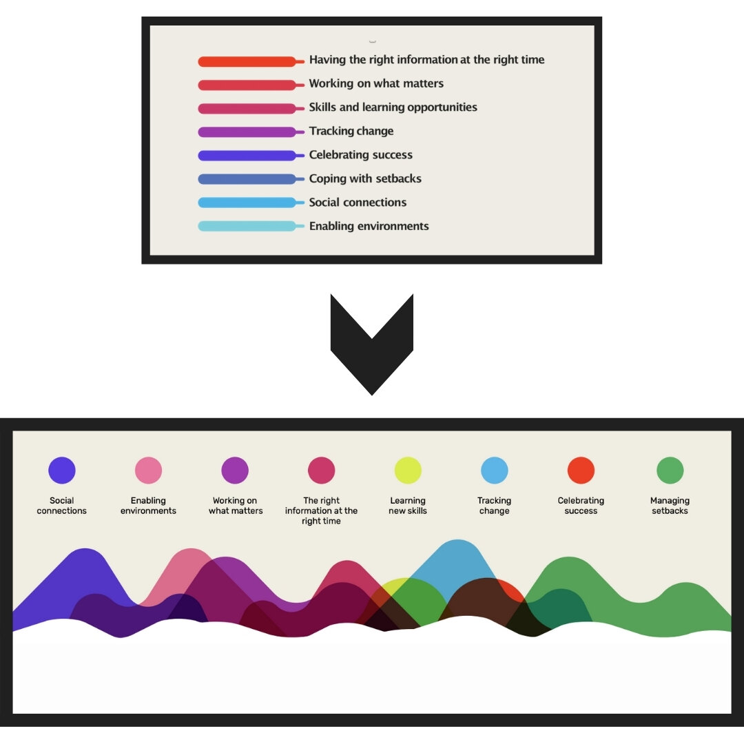
For example, the guide encourages readers to use eight, evidence-based characteristics of ‘Good Help’ to generate ideas. In earlier drafts, these were introduced as a list from top to bottom. The co-design group was tasked with using these to brainstorm a hypothetical ‘Good Help’ offer, grounded in evidence. They came up with all sorts, from a vlogging platform to share experiences of chronic health issues, to new ways of getting out and connecting with nature. But for all of them, the eight characteristics felt like a checklist. Rather than thinking about which characteristics would be right for their particular context, constraints and population, they were thinking about how to “catch them all”.
So we changed it up. We used imagery to remove the hierarchy, creating a more fluid structure with a varied colour palette, to help us communicate that there’s no ‘right’ way of combining them – one offer of help might influence one characteristic, while another might influence several. We wanted to show that each characteristic, and the way they’re brought together, will look and feel different in different contexts.
We used imagery to remove the hierarchy, creating a more fluid structure with a varied colour palette.
The Words
One of the characteristics of Good Help is ‘working on what matters’ – this means understanding what is important to each individual and tailoring support to their preferences. The language of a Good Help guide must be informed by a deep understanding of the intended audience, and be pitched accordingly – but that’s no easy task! There will always be misunderstandings with language, both when the writer tries to put their ideas into words, and when the reader turns those words back into ideas. Some loss of meaning, drawn from our different experiences and connections with language, is inevitable.
The co-design group quickly identified many of these misunderstandings. For example, when the group looked through ‘working on what matters’, some of those with lived experience pointed out that our description failed to really get across that these goals should consider the wider aspects of health and wellbeing beyond their medical condition. Whether it’s getting back to work or picking up a new skill, these goals should focus on what’s important to each individual, according to them. They described the importance of having these conversations outside of clinical settings, whether at home or in the community, to help reinforce that ‘working on what matters’ concerned them as people, not just as patients.
The Structure:
The purpose of the guide is to facilitate evidence-based brainstorming. Earlier iterations provided explanations of each characteristic, but they didn’t give a clear process for using that information to generate ideas. This meant that when the co-design group tested it out, they tended to move away from the guide when the brainstorming got going, and away from the evidence contained within it.
In response, our partnership designed a flexible and iterative process for brainstorming to accompany each characteristic. Those using the guide are supported to work through cycles of thinking, by generating ideas then revising them based on regular moments of reflection, during which they check back in with the evidence from the characteristics as well as common pitfalls they’re likely to come across. By providing a clear process to follow, the guide helps people to brainstorm creatively while remaining aligned with the evidence.
We’re excited to see how Reimagining Help will be picked up and used by those working across the health sector and beyond. By combining the best evidence on behaviour change with the principles and practices of user-centred design, this guide offers a new way for us to support people to take control of the help they receive.


